Deliverable Samples
Wireframe Docs
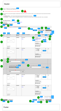
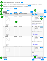
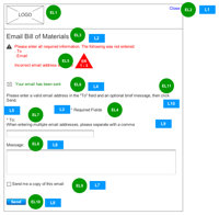
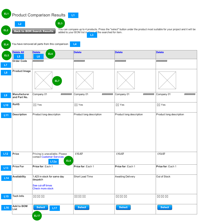
Below are a couple of samples of the full final wireframe documentation in PDF format with all the language elements and interaction details in tables after the wireframe image is imported.
 – 3.2.26 Index list / File Selection – [309 KB]
 – 3.2.28 Verify Items – [284 KB]
Wireframe Images:
The wireframe images below were all imported into similar docs as the above with the detailed interactions specified in tables.
Project Description
My Role: Lead UX Researcher & Architect
The Parts List Upload web app is a tool intended to allow electronic component buyers to quickly upload their Bill of Materials (BOM) parts lists to the ecommerce site. They could then run a search against that list to find the parts along with the related availability, pricing, and other essential information for selecting parts for purchasing. This project initially started over 6 years ago, but was not implemented due to priorities until a new platform project included it as part of a global update.
My participation included helping structure user interviews and working with the BA who started the project. Later, when it was picked up again, I lead the usability testing on what was implemented in the new platform. And most recently, after the launch when it was clear users continued to have problems, another UX architect and I worked on revising the wireframes and user testing of a prototype
Team
- 2 BAs: only 1 BA during each phase
- 2 UXAs
- 2 Developers
- 1 PM
- Stakeholders included: Director of eCom, Director of eCom Operations, SVP of Global Marketing
Activities and deliverables
- UX coaching
- Sketching
- Wireframing
- Prototyping
- Usability Testing
Project Details
The Early Days
This project was on a list of projects to be done in 2008. The initial work team included a BA and myself as a UXA at the time. My role at that point was limited to advising as the UX team (all 2 of us) were working on another larger global project (the Community). I helped the BA plan some user interviews to be conducted by phone to get feedback on the concept and some early screen mocks he had created. I coached him through the first couple calls and followed up when he had finished.
Initial Findings
From the interviews he learned that given the breadth of some lists, users would typically only find 50% of the products they need on one distributor’s site. For them, the challenge would be having to go to multiple distributors to be able to source all the parts. And while they would compare prices on the items that overlap, it was more important to them to manage the unique parts that only one distributor carried. For this it was very important that the order of their lists was maintained in the process, to make it easier to compare to their original list.
Users also had a wide variety of formats for the excel file that these types of lists were maintained. Some had very elaborate spreadsheets with columns for tracking all manner of information about the product. Others had simple spreadsheets with only a part number and quantity. One final oddity was with the acronym, we originally used proper capitalization of bill of materials as BoM, but the users indicated that they preferred it to be all capitalized as BOM.
Several years went by and the parts list upload was finally built out on our new web platform. However, due to the time lapse, the original BA was gone and the developers made changes during implementation without coming back to the UX team. When it was launched it did not seem that users were able to effectively use the new feature.
The Redesign
Eventually I was able to get some usability testing planned for this and other features of the new platform and found some major problems with the implementation. First, users simply did not understand the purpose of the tool. Those who did try it out had difficulties at several points, for example; one problem came with not knowing they needed to choose a search column, another problem came up when entering a number for the row where their data starts. Most critically, they also had trouble after starting the verification and then not knowing where to go next as it would sit there. If they clicked a button to close the window it just left them on the choose search column page.
I did the initial wireframes for the redesign, which I then turned over to another UXA to be revised as the project progressed. There were significant changes that we had to make for the implementation as all the work could not be completed in a single sprint. The redesign included an improved workflow where users would be returned to the main index listing if they closed the verify items progress overlay. Now it would clearly indicate it was still being processed and will display an update when it is ready. I also added the ability to select the spreadsheet tab for users with more complex spreadsheets. Lastly, I also improved the verify items page with an improved UI for items that had multiple matches. This differentiates those items from the ones that had no match at all.
Lessons Learned
I learned that UX really has to get involved as early as possible in any project to develop new features or extend existing features of a site. The development team cut corners by not including the UX team in the changes they made during implementation of a project that sat on the shelf for several years. Pushing for basic usability testing early on would have helped avoid many of the major problems.


