Deliverable Samples
Guidelines for Accessible Tables
I performed a review of the html that the front end developers were creating and provided specific accessibility guidelines for how to make the site compliant with section 508.
 – Guidelines for Accessible Tables – [78 KB]
Screen Mock Samples
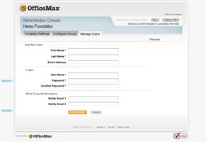
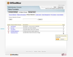
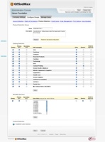
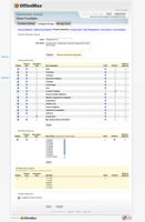
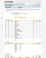
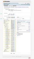
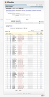
This is a small selection from over 100 screen mocks created to represent the detailed UI. I used the new, at the time, Adobe Photoshop smart layers to manage the header and footer across multiple files.
Project Description
My Role: Research Assistant & UI Designer
This project was the second part of a much larger effort to completely redesign both the B2C and B2B ecommerce applications for a major office supplies retailer. A major factor in the redesign was also the migration to a new platform. The current B2C platform was on an old version of the Broadvision ecommerce system and the B2B site was a completely custom built web application. They had just finished wrapping up the redesign of the B2C site when I was asked to work on the redesign of the B2B web administrative configuration application.
The main purpose of the application was to allow customers to create custom catalogs that would restrict buyers to certain products and categories. It also had an approval workflow configuration feature to help manage the procurement process and control spending. There was also the front-end, which provided the shopping and purchase functionality. One of the other key requirements was to make the site section 508 compliant as we had a large number of federal government customers.
The Team
- 1 UX designer
- 1 Business Analyst
- Stakeholders included: Directors of Usability, of eCommerce, and Sr Director of eCommerce
Activities and deliverables
- Site Interviews
- Whiteboard Sketching & Hi-fi Mocks
- Section 508 review and guidelines

We conducted a site visit at the Bristol VA Business support call center
Project Details
Site Observations
After discussing the goals of the project with the key stakeholders and work team, it was decided that the business analyst and I should visit the business support call center to see how the current application was used and to also observe what other challenges they may be having while configuring and setting up business customers. There were basically no actual customers who used the application themselves because it was so complicated. Even with only internal staff using the application, it would take several months to train staff in how to properly use the application. One of the goals of the project then, was to at least make it easier to learn for the support staff.
One of the early findings observed during the visit was that the call center staff needed to master several applications in addition to this admin application. Staff would have to access back-end account systems to get information specific to the account as well as other systems used to support order problems and other issues. The staff would typically have multiple screens open at one time, while also talking to the customer by phone.
Another key finding was related to the process of creating custom catalogs. With a product inventory of over 40,000 products, this was quite complicated and manual. There were a multitude of ways that customers would want to block combinations of categories, types of products, and specific products from being available to buyers. Customers might have a contract to only buy certain supplies from one vendor and other supplies from a different vendor. In order to do business with them, the catalogs would need to meet their expectations by not allowing those items to even be seen while shopping.
Another area of complexity was the approval workflow set-up. Essentially, businesses have all kinds of patterns for wanting to limit and control the spending and the application needed to allow for that customization. We had to be able to create workflows for two person teams to teams of dozens of buyers and multiple tiers of purchase authority.
Whiteboarding & Hi-fidelity Wireframes
After we came back and further analyzed our notes from the observations, we would begin sketching concepts on the whiteboard. Once we had settled on the key UI needs, I started work on a set of hi-fidelity mocks. We decided to use hi-fidelity mocks rather than wireframes screens for several reasons. As screens were completed they would be turned over to a an html/css/js production developer, who would convert them to html as they were approved. Another benefit is they could be shown to senior stakeholders as part of status updates.
This was made easier as I was just updated to the latest version of photoshop at the time. Which had just introduced the then novel smart layers feature which allowed you to include other psd files into a different psd file. So it was like a web template, I could create a single instance of the header and footer and then include that into a page file. If there was a change to the header or footer, I could update the one file, instead of having to change all the individual pages.
There were approximately 100 screens/pages to represent, with some requiring multiple instances to display certain interactions. The BA and I would meet regularly 2 or 3 times a week to review screens and sketch on the white board different ideas on how to solve problems.
Section 508 review and accessible tables guidelines
Another key requirement was for the new admin app to be fully section 508 compliant. We had many federal government customers and the redesign was taking place just as Target was being sued for non-compliance with basic accessibility (Which they subsequently lost). So I was tasked with performing an accessibility review of the front end code and provided guidelines for the front end developers to follow. One of the main areas of concern were the tables used for displaying the myriad of configuration options for the products and catalogs. I provided several 508 compliant html guidelines for different parts of the UI including forms and one for the tables which had code samples the front end developers could follow.
Lessons Learned
One of the main things I learned during this project is that even when you meet with and observe users of an application, there can still be disagreements about solutions amongst the team. One of the solutions I proposed for the creation of custom catalogs was a search function for allowing or restricting items in the catalog at varying levels of search granularity. From top level categories, all the way down to part number specific items. The current version was a mirror of their hierarchical browse navigation with checkboxes at each level. This required that someone understood how to find things by browsing and even though they had internal staff using the application, it was observed that users would often go in and out of multiple categories looking for a sub-category or specific item.
I’d like to say that I won over the objections of the main BA with persuasive reasoning, but they were adamant that the hierarchical approach was the better approach. The only improvement made was to have the browse navigation expand and collapse so that users would not have to navigate back. Even though the BA had seen the same users struggle with the browse approach as I had, he could not see that a search or rules based approach might be more flexible and simpler way to define a custom catalog. I’ve also learned that sometimes you have to let another person make a bad decision, before they will trust you when you challenge them in their assumptions.

